
CSS tips
CSS filter generator to convert from black to target hex color
color-scheme
页面开发者可以指定页面元素默认的配色方案,值为dark, light等
https://developer.mozilla.org/en-US/docs/Web/CSS/color-scheme
color-scheme: normal;
color-scheme: light;
color-scheme: dark;
color-scheme: light dark;
prefers-color-scheme
获取用户对配色方案的偏好
https://developer.mozilla.org/en-US/docs/Web/CSS/@media/prefers-color-scheme
@media (prefers-color-scheme: dark) {
  .day.dark-scheme   { background:  #333; color: white; }
  .night.dark-scheme { background: black; color:  #ddd; }
}
配色方案
- blue-red-yellow-green: https://www.schemecolor.com/blue-red-yellow-green.php
max-content
max-content sizing keyword represents the intrinsic maximum width of the content. 是一个大小的关键字,是内容的自然宽度(不折叠)。
<div id="container">
  <div class="item">Item</div>
  <div class="item">Item with more text in it which will overflow the fixed width box.</div>
</div>
.container {
  background-color: #8cffa0;
  padding: 10px;
  width: 200px;
}
.item {
  width: max-content;
  background-color:#8ca0ff;
  padding: 5px;
  margin-bottom: 1em;
}
文本固定长度,超出部分显示省略号
<span style=" display: block; width: 100px; overflow: hidden; white-space: nowrap; text-overflow: ellipsis;"
Hello world this is a long sentence
<span>Hello world this is a long sentence</span>
span {
  display: block;
  width: 100px;
  overflow: hidden;
  white-space: nowrap;
  text-overflow: ellipsis;
}
height
-
100%, 高度为父元素的所有可用高度 -
auto, 高度为子元素的所有高度之和 -
max-content, 子元素不折叠时的自然高度 -
同时设置了
flex-basis和height / width时,flex-basis具有优先级
resize
设置元素在某个方向上可以拖动改变大小
overflow: scroll;
resize: none;
resize: both;
resize: horizontal;
resize: vertical;
resize: block;
resize: inline;
以下情况不生效
- inline elements
- Block elements for which the
overflowproperty is set tovisible
resize 忽略其它属性,例如 max-height
resize 时会自动添加 height 属性,有时候会与 max-height 冲突。这时候可以使用属性选择器,忽略 max-height
.content {
  resize: both;
  max-height: 5em;
}

.content[style*="height"] {
  max-height: unset;
}
CSS to detect phone screen orientation
- portrait: vertical
- landscape: horizontal
@media screen and (orientation: portrait) { … }
@media screen and (orientation: landscape) { … }
Rainbow border
<div class="container">
  <div class="top-round-rainbow">
  </div>
</div>
.container {
  background: #596678;
  height: 300px;
  display: flex;
  justify-content: center;
  align-items: center;
}

.top-round-rainbow {
  width: 50%;
  height: 50%;
  border-radius: 4px;
  background: repeating-linear-gradient(to right,
    #c4e17f 0%, #c4e17f 12.5%,
    #f7fdca 12.5%, #f7fdca 25%,
    #fad071 25%, #fad071 37.5%,
    #f0766b 37.5%, #f0766b 50%,
    #db9dbe 50%, #db9dbe 62.5%,
    #c49cdf 62.5%, #c49cdf 75%,
    #6599e2 75%, #6599e2 87.5%,
    #61c2e4 87.5%, #61c2e4 100%), white;
  background-size: 100% 10px;
  background-repeat:no-repeat;
}
Precedence
- !importtant
- inline css
- more specific
- apper later
placehoder loading
<div class="placeholder"></div>
.placeholder {
  height: 50px;
  background: linear-gradient(to right, #f3f3f3 5%, #eee 20%, #f3f3f3 35%);
  animation: placeholderShimmer 2s linear 0s infinite normal forwards;
}

@keyframes placeholderShimmer {
  0% {
    background-position: -500px 0;
  }
  100% {
    background-position: 500px 0;
  }
}
text-overflow
需要配合其它属性才会生效
display: block;
overflow: hidden;
white-space: nowrap;
text-overflow: ellipsis;
Selector
Exclude class
使用:not
.class:not(.other) {
}
overflow-x: visible and overflow-y: auto
overflow-x: visible; // -> auto, visible won't work
overflow-y: auto;
另一个方向使用非 visible会导致目标方向的visible变成auto。
Ref: https://stackoverflow.com/a/6433475/5154601
Tab
div 需要 tabindex 和 focus 才能触发 key event
Hide tab outline
[tabindex] {
  outline: none !important;
}
Prevent tab
if (e.code === 'Tab') {
  e.preventDefault();
  this.$refs.input.blur();
}
Or tabindex="-1"
Grid background
使用垂直的 linear-gradient 形成网格效果
.grid-bg {
  width: 800px;
  height: 800px;

  background: #e9e9e9;
  background-image: linear-gradient(0deg, #f4f4f4 1.1px, transparent 0), linear-gradient(90deg, #f4f4f4 1.1px, transparent 0);
  background-size: 20px 20px;
}
box-sizing
-
content-box,是浏览器的默认行为,宽度和高度不包括 broder 和 padding。
-
border-box,元素的宽度和高度包括了 border 和 padding。适用于需要限制元素整体宽度和高度的情况。
Margin collapse
Why
可以统一设置样式,不用单独处理最后一个元素
p {
    margin-top: 10px;
    margin-bottom: 10px;
}
Basic rules
- 垂直方向
- 块元素
- 两个元素直接接触,没有 padding,border,line boxes 等
Dynamic font size
可以使用vw, vh作为字体单位。
Pure CSS to make font-size responsive based on dynamic amount of characters - Stack Overflow
div {
    font-size: 30px;
    font-size: 3.5vw;
}
iPhone X 屏幕底部留白
.container {
    padding-bottom: env(safe-area-inset-bottom);
}
<meta name='viewport' content='initial-scale=1, viewport-fit=cover'>
Designing Websites for iPhone X | WebKit
Outline
outline: style width color;
.class {
    outline: thick double red;
}
Outlines vs. borders
- Outlines 不占用空间,总是在元素的外部。
- 根据标准,不一定非得是矩形。
动态添加 :hover
Change :hover CSS properties with JavaScript
通过 style 标签
const css = `
    .class:hover { opacity: 1; }
    .class { opacity: 0 }`;
const style = document.createElement('style');
if (style.styleSheet) {
    style.styleSheet.cssText = css;
} else {
    style.appendChild(document.createTextNode(css));
}

document.getElementsByTagName('head')[0].appendChild(style);
// dom.appendChild(style);
通过 mouse event 事件修改样式
mouseover, mouseenter, mouseleave 等
dom.addEventListener('mouseover', event => {});
node.children / node.childNodes
children: 类型为 Element
childNodes: 类型为 Node
Flip Card 旋转卡片效果
组合使用 transform: rotateY(180deg); 和 transition: transform 0.8s;。rotateY 可以让目标绕 Y 轴旋转。
How To Create a Flip Card with CSS
<div class="flip-card">
    <div class="flip-card-inner">
        <div class="flip-card-front">
            <div>Hello, this is front</div>
        </div>
        <div class="flip-card-back">
            <div>Hello, this is back</div>
        </div>
    </div>
</div>
/* The flip card container - set the width and height to whatever you want. We have added the border property to demonstrate that the flip itself goes out of the box on hover (remove perspective if you don't want the 3D effect */
.flip-card {
    background-color: transparent;
    width: 300px;
    height: 200px;
    border: 1px solid #f1f1f1;
    perspective: 1000px; /* Remove this if you don't want the 3D effect */
}

/* This container is needed to position the front and back side */
.flip-card-inner {
    position: relative;
    width: 100%;
    height: 100%;
    text-align: center;
    transition: transform 0.8s;
    transform-style: preserve-3d;
}

/* Do an horizontal flip when you move the mouse over the flip box container */
.flip-card:hover .flip-card-inner {
    transform: rotateY(180deg);
}

/* Position the front and back side */
.flip-card-front, .flip-card-back {
    position: absolute;
    width: 100%;
    height: 100%;
    backface-visibility: hidden;
}

/* Style the front side (fallback if image is missing) */
.flip-card-front {
    background-color: #bbb;
    color: black;
}

/* Style the back side */
.flip-card-back {
    background-color: dodgerblue;
    color: white;
    transform: rotateY(180deg);
}
点击选中所有文本
function selectText(containerid) {
    if (document.selection) { // IE
        var range = document.body.createTextRange();
        range.moveToElementText(document.getElementById(containerid));
        range.select();
    } else if (window.getSelection) {
        var range = document.createRange();
        range.selectNode(document.getElementById(containerid));
        window.getSelection().removeAllRanges();
        window.getSelection().addRange(range);
    }
}
实现箭头图标
实心箭头
.down-arrow {
    border-top: 5px solid black;
    border-bottom: 5px solid transparent;
    border-right: 5px solid transparent;
    border-left: 5px solid transparent;
    width: 0px;
}
空心箭头
.down-arrow {
    border: solid black;
    border-width: 0 3px 3px 0;
    display: inline-block;
    padding: 3px;
    transform: rotate(45deg);
}
Loading 效果
https://www.w3schools.com/howto/howto_css_loader.asp
<div class="loader"></div>
.loader {
    border: 6px solid #f3f3f3;
    border-top: 6px solid #3498db;
    border-radius: 50%;
    width: 40px;
    height: 40px;
    animation: spin 1s linear infinite;
}

@keyframes spin {
    0% { transform: rotate(0deg); }
    100% { transform: rotate(360deg); }
}
修改输入框光标 input caret
input {
    caret-color: rgb(0, 200, 0);
}
文本过长时显示省略号
可以用 JavaScript 的 replace 方法替换掉过长的字符,但需要考虑中英文长度不同的问题。
还可以使用 CSS 新特性 text-overflow 实现该效果。
white-space: nowrap;
overflow: hidden;
text-overflow: ellipsis;
禁用双击后选中文字或图片
user-select: none;
避免background 设置图片后位置偏移
需要组合使用 backgorund-image 和 background-size
background-image: url('path/to/image');
background-size: contain;
或者
background-image: url('path/to/image');
background-size: cover;
background-repeat: round;
默认背景图片按原始大小渲染,可以通过backgorund-size改变其大小
- contain: 不剪裁和缩放的前提下尽可能大
- cover: 尽可能大地覆盖元素,可以剪裁
- auto
- length
- percentage
relative 定位父元素,如何与 absolute 定位子元素的高度一致?
无法通过单纯的样式达到,子元素在逻辑上属于父元素,但在物理上脱离了父元素的布局。
方案
- 手动设置
height - 用 JavaScript 动态计算
height
div > img,图片底部出现多余空白
图片默认是按inline渲染的,像字母(a,b,c,d)一样会在底部出现多余的空白。
要去除空白,可以修改,
display: block
或设置
vertical-align: middle
text-indent + letter-spaceing 保持文本间距和居中
text-indent: 30px;
letter-spacing: 30px;
rpx, px, 物理像素
规定屏幕宽为 750 rpx
在 iPhone6 上,屏幕逻辑分辨率(宽度) 375 px, 物理像素 750 个。那么
    750 rpx = 375 px = 750 物理像素
    1 rpx = 0.5 px = 1 物理像素
px to rem 转换
rem: font size of the root element。
根据 rem 设置 font-size, height, weight等,可以实现响应式的布局。
网站
如果
:root {
        font-size: 16px;
}
那么 1rem = 16px
移动端
如果
:root {
        font-size: 62.5%; /*10px*/
}
那么
rem = window.innerWidth / 10
那么对于屏幕宽度为 750px 的手机来说,1rem = 75px
逻辑分辨率(logic):软件支持的分辨率(css 和 DOM 用到,例如:window.innerWidth = 375)
物理分辨率(physical):硬件支持的分辨率(设计师经常用来标注的尺寸,例如 750 的设计稿)
设置透明背景色
使用opacity会导致整体透明化;如果仅需背景透明,可以使用rgba
background-color: rgba(0, 0, 0, 0.5);
LESS to CSS
    npm i less -g

    lessc source.less target.css
CSS Modules
CSS Modules是模块化、可复用 CSS 的一套标准。可以在 JavaScript 中以模块的方式引用 CSS 类名。具体实现有
-
前端:Webpack's css-loader
-
后端、静态:postcss-modules
box-sizing 指定盒模型高度、宽度计算方式
box-sizing: content-box;
/* default,width/height does not include padding, margin or border. */

box-sizing: border-box;
/* width/height includes padding, margin or border. */
inline-block 顶部对齐
.align-top {
        display: inline-block;
        vertical-align: top;
}
颜色渐变
@keyframes color-gradient {
    0% { background:yellow }
    50% { background: green }
    100% { background: yellow }
}

.div-gradient {
    width: 100px;
    height: 100px;
    animation: color-gradient 3s infinite;
}
旋转
@keyframes rotate {
    from { transform: rotate(0deg) }
    to { transform: rotate(360deg) }
}

.div-rotate {
    width: 100px;
    height: 100px;
    background: wheat;
    animation: rotate 3s linear infinite;
}
移动端缩放处理
viewport是指页面对用户可见的范围,一般设置成设备宽度,可以铺满任意设备的整个屏幕。
<meta name="viewport" content="width=device-width, initial-scale=1.0" />
透明度继承问题
父元素设置透明度后,所包含的元素整体都透明了。这可以看成是容器的透明化而非继承。如果只是背景色需要透明,可以使用rgba
background: rgba(0, 255, 255, 0.5);
盒模型立体背景
box-shadow: 0 1px 6px rgba(0, 0, 0, 0.12), 0 1px 4px rgba(0, 0, 0, 0.12);
字符间距
letter-spacing: 1px;
换行
white-space:处理空格符和换行
white-space属性设置如何处理元素内的空白(空格符)和换行。
对比
| 空格、Tabs | 换行符 | 文本自动换行 | |
|---|---|---|---|
| normal | 合并 | 合并 | 换行 |
| nowrap | 合并 | 合并 | 不换行 |
| pre | 保留 | 保留 | 不换行 |
| pre-wrap | 保留 | 保留 | 换行 |
| pre-line | 合并 | 保留 | 换行 |
normal: 合并空格,文本的换行符作为空格处理。在需要填充容器时换行
nowrap: 合并空格,取消换行
pre: 保留空格。在文本的换行符和<br>处换行
pre-wrap: 保留空格,在文本的换行符、<br>处、需要填充容器时换行
pre-line: 合并空格,在文本的换行符、<br>处、需要填充容器时换行
例子:文本不换行,除非遇到<br>标签
p.a {
        white-space: nowrap;
}
word-wrap | word-break:单词折叠换行
word-wrap允许单词折叠到下一行
div {
        word-wrap: break-word;
}
word-break设置了到达行尾时单词的折叠方式
p.a {
        workd-break: break-all;
}
clip-path
clip-path 简单理解为可以更改元素边框的形状。
clip-path: circle(40%);
clip-path: ellipse(130px 140px at 10% 20%);
clip-path: polygon(50% 0, 100% 50%, 50% 100%, 0 50%);
清除浮动
使用 float 后会导致父元素高度与子元素脱节,那么如何将父元素和子元素重新联系起来呢?
::after 自动添加
父元素也设置浮动
.wrapper {
        float: left;
}
父元素添加伪类
.wrapper::after {
    display: block;
    content: "";
    clear: both;
}
手动添加
子元素后面添加一个空元素,用来清除浮动(clear: both)。
.clearfix {
        clear: both;
}
inline-block + width 50% 保持同一行
出现换行的原因一般是元素间有换行符或空格,需要使用 white-space: nowrap 让文本不换行
.inline-block {
    display: inline-block;
    width: 50%;
    white-space: nowrap;
}
使用 pointer-events 禁用 <a>
a.disabledLink {
        pointer-events: none;
}
pointer-events指定什么情况下某个元素可以成为鼠标事件的 target 。
none代表鼠标可以忽略并穿透目标元素,指定下面的元素。
sans-serif 无衬线字体的意思
摘自 wiki:无衬线字体
无衬线体(Sans-serif)指没有衬线的字体。与衬线字体相反,完全抛弃装饰衬线,只剩下主干,造型简明有力,更具现代感,起源也很晚。适用于标题、广告,瞬间的识别性高。这类字体在汉字等东亚字体中称黑体,与有衬线的白体相对。
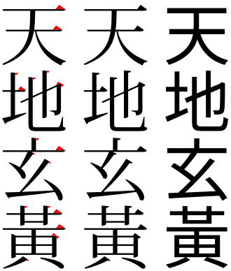
从左到右:宋体红衬线、宋体、黑体
pt 和 px
px(pixel):指图片上的一个点。常见的分辨率表示了图片由多少个网格点组成。 pt(point):是一个长度单位,通常用来表示字体的长度。实际中,1 pt 等于 1/72 inch。
联系:px 大小取决于图片的 ppi(pixels per inch)。当图片为 72 ppi 时,1px = 1pt。
vh
vh(view height)代表视窗高度的 1/100。要设置元素高度占窗口的 80%,可以
.class {
    height: 80vh;
}
::before ::after
pseudo-element,为了和 pseudo-class 区分而使用两个冒号(CSS3)。
会在选择的元素内部添加第一个/最后一个子元素。不适用于 input, img, iframe 等 replaced elements
用于给元素添加自定义内容和样式。content 可以使用 unicode 编码生成图标 。
.class::before {
    content: '\2713'; /*✓*/
    color: gray;
    visibility: visible;
    float: left;
}